

We’re delivering you a more engaging view of your digital marketing data
In this video post we’ll explain why we’re moving from automated monthly PDF reports to live dashboards.
Video Transcript (kind of).
Below is the “script” I wrote specific for this video and decided not to follow during the recording. I have a tendency to speak from the heart and go with the flow. This trait also makes me terrible at line-dancing.
My name is Kevin Alvarez and I am the founder and chief marketing strategist of Blue Lynx Marketing.
Today I wanted to introduce a few important changes we have made with how we are delivering reporting to our partners.
In the past, we would work on month-end summary reports that would be emailed as PDFs. Although Monthly Summary reports are useful, we feel the methodology in how we were creating and delivering them has become outdated.
We have transitioned to live reporting dashboards that allow you to view a summary of your key data metrics any time you choose. In addition, we have created these dashboards so that you have control to adjust filters and segments and therefore giving you a more in-depth view of your marketing summaries.
In the next few minutes I will show you how you can use your new dashboard using some demo data.
Before we start though, I do want to express that these reports can be customized for your specific needs.
If you have special metrics or changes you would like for us to make, just let us know and we will make the adjustments.
The initial reports we have created are a good starting point and will accommodate the primary needs for most of our partners.
So let’s dive in and take a look at the new Digital Marketing Overview dashboard.
The first report we developed is the Digital Overview Report that was heavily influenced by Luna Metrics.
This dashboard is designed to show you the basic fundamental key metrics for your website and includes some important conversion goal metrics as well as some filters to help you segment your data in interesting ways.
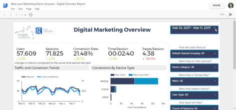
Section 1 – Traffic and Engagement Metrics
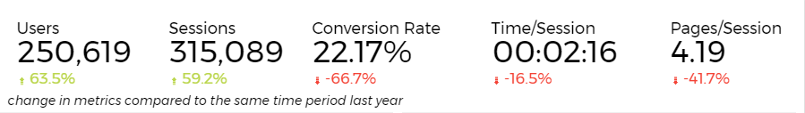
The first section covers key metrics regarding your website traffic growth as well as visitor engagement metrics. By default, we compare this data with year-over-year comparisons so you can determine how well or poor your site performed in the same period from the previous year. If you prefer to see comparisons over the previous period (for example, February over January), we can make that change for you.
Section 2 – Goal Completions by Date (compared to sessions); By Device & User Type
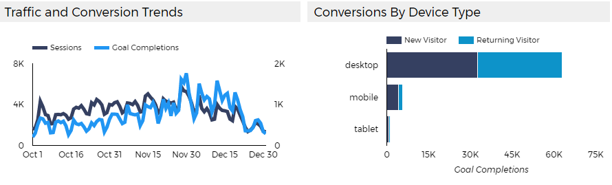
The first part of section 2 compares conversions with sessions and features a timeline graph to help identify any trends. You can mouse over the timeline for specific metrics for each day in the timeline.
The second part of section 2 breaks down conversions by device as well as new users vs. returning users.
It’s good to know if you see most of your conversions are coming from repeat visitors, maybe it means we need to focus more efforts on email marketing and/or re-targeting campaigns. Or perhaps if we see most conversions are happening on desktop but mobile is very low, this could be a strong indication that we need to improve the conversion process for users on mobile devices.
Keep in mind that depending on how we have established goals for your business, not all goals may equal leads. For example, some partners we may ONLY be measuring a completed contact form or new caller over 60 seconds (leads) as a goal while other partners may include more micro goals such as “played a video” or “visited a key page and with time on page of 2 minutes”. Either way, the point of any “overview report” is to simply identify quantitative trends to determine if things are moving in a positive direction.
Section 3 – Goal Completions By Source/Medium; Most Popular Pages (by entrance)
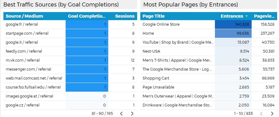
The first part of Section 3 shows us which traffic sources are producing the most traffic and more importantly – conversions. The second part of Section 3 shows you which of your landing pages are generating the most entrances as well as overall page views. This helps us determine which pages are attracting visitors as well as which pages visitors are gravitating to once on your site.
In both parts of section 3, we only made the Top 10 entries visible by default but you can click on the arrows in the bottom right to scroll through the rest of the results.
In our more in-depth analysis, we’ll know which pages and content is leading to the most conversions but this analysis requires a more detailed conversion funnel view and probably does not belong on a one-page dashboard. The point of this dashboard is to provide you with a quick easy-to-follow overview to get a quick view of key data points and to allow you to continue putting focus on your business. Our partners depend on us to sift though the data and find the gems that lead to recommendations and suggestions that will improve your online visibility and bottom line.
Filtering and Segmenting The Data On The Fly
Now, I will want to show you one of the cool aspects of the Dashboard which is the filtering and segmentation.
By default the report will show you the metrics for the previous completed month.
However, if you want to see the data from a previous period or modify the date range, you can do so by clicking in the top right.
Under the date range, you will see other filters. We named these filters to help you understand how the data will be sorted. For example, if you want to see the metrics specifically based on users who came from paid search ads, you can click on the “only” text link next to Paid Search.
One other cool filter we have included for our partners who specifically serve local markets is to see how your local traffic is performing. This filter will allow you to analyze data based on the 10 Metro areas delivering the most traffic to your site.
We want to re-iterate that “overview reports” are simply that. We realize this report barely begins to tell the whole story and it’s also important to keep in mind the axiom “correlation does not equal causation” especially when looking at a summary. Any increase or decrease in a measurement needs to be analyzed from various angles before assuming the cause.
We’re excited about sharing these new dashboards with you as they give you a more engaged view of your website activity and also provide you with freedom to view your key metrics when it is convenient for you.
We’ll always be working to make improvements and to consolidate more data into the dashboards of our marketing partners. We have already created Dashboards for those advertising with AdWords.
